A small business introducing an unfamiliar product
Doia was a small skincare business I co-created with my business partner, centred on a moisturiser made with natural ingredients and recyclable packaging. As a new brand, we needed to introduce an unfamiliar product and give visitors enough information to consider buying from us.
I designed and implemented the Shopify store. A trademark opposition later prompted a rebrand, which I used as an opportunity to revisit the shopping experience. Before launch I explored competitor websites, Amazon listings, customer reviews, ingredients, packaging preferences and price points, and gathered feedback by testing the product with friends and customers. Natural ingredients and considered packaging became the central ideas the website needed to communicate.
My contribution
I customised a Shopify theme, arranging its available sections into the shopping journey, and wrote the site's copy and content structure. I also owned branding, packaging design, supplier communication and Amazon listing content.
Managing customer enquiries and fulfilment gave me direct exposure to practical questions around the shopping experience. My business partner developed and manufactured the moisturiser and provided photography.
Project constraints
A small business budget, and Shopify's theme components to work within.
Limited website analytics, so the redesign drew on qualitative feedback, competitor research and the experience of running the business.
Changing the homepage priorities
The original homepage introduced the brand, presented a product card, and followed with brand values and educational blog features. During the redesign, I shifted the emphasis towards the specific product visitors were considering.
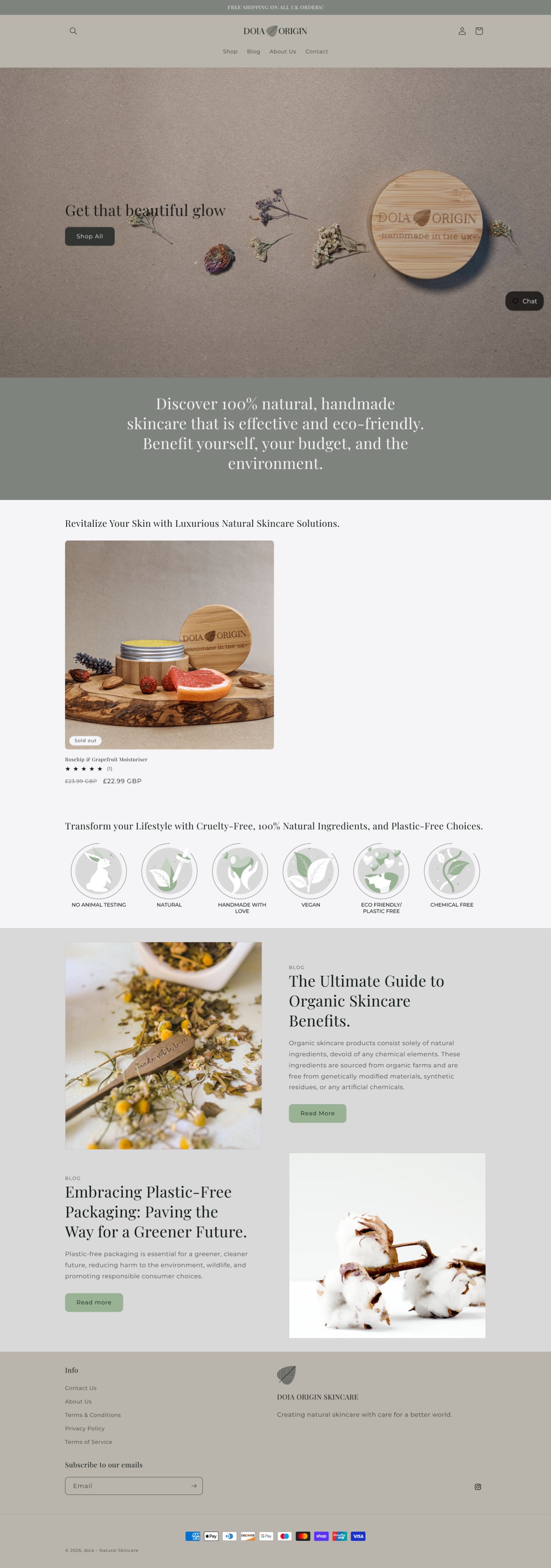
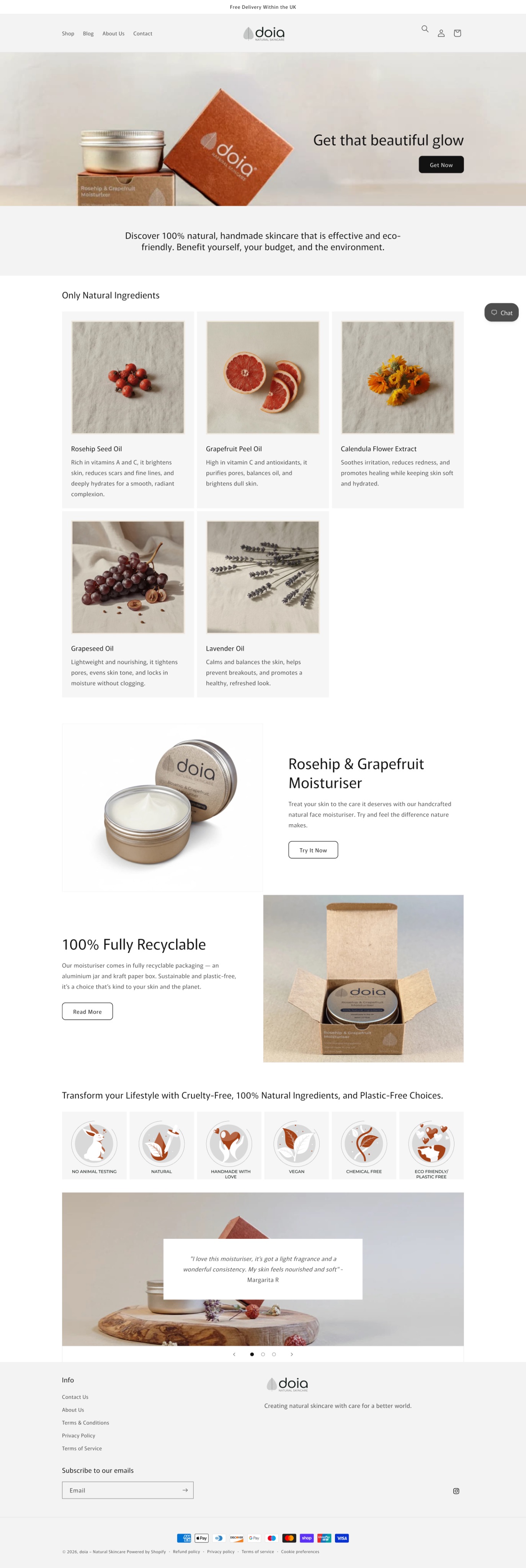
Scroll inside each page to compare, or tap one to open it full size. The sections below use larger crops of each change.
What changed
Ingredient information introduced into the homepage
Packaging explained through the actual product
Customer feedback given a dedicated section
Explaining the product before purchase
I brought product-specific information into the homepage and gave the moisturiser a dedicated introduction.
Ingredient information in the main journey
A dedicated section near the top of the homepage uses five image cards with names and short descriptions, making the natural-ingredient proposition more concrete.
From catalogue-style card to product introduction
I replaced the product card with a larger product image, a short introduction and a ‘Try It Now’ button. A purchase prompt also remained in the hero for visitors ready to shop immediately.
Making the natural-ingredient proposition concrete, so visitors could explore what the moisturiser contains.
A catalogue-style product card, brand values and educational blog features.
Added a five-card ingredient section near the top, then a larger product introduction with a ‘Try It Now’ button.
Visitors could explore ingredients directly on the homepage, then move into the product introduction.
Supporting purchase decisions with packaging and customer feedback
Packaging
Physical packaging: I replaced the earlier wooden outer container and cotton drawstring bag with a revised aluminium jar and paper box, aiming to simplify shipping and make Amazon labelling easier. Website: a homepage section now explains that packaging to customers.
Connecting the brand message with what customers would receive.
A general article about plastic-free packaging.
A section showing the actual aluminium jar and kraft paper box.
Make the packaging tangible by showing the jar and box customers would receive.
Customer feedback
The original product card already included a small star rating. The redesign added a dedicated testimonial section near the end of the homepage, intended to provide another source of information alongside our own descriptions.
Customer feedback expanded beyond the product-card rating.
A consistent experience across the store
I redesigned the logo, colours and typography, then applied the new identity throughout the store. The revised homepage uses white and pale-grey backgrounds, black buttons and warmer product photography.
I built the store using Shopify themes and their available sections, selecting, arranging and customising them alongside typography, colours, imagery and copy. I kept familiar navigation labels while substantially changing the homepage content sequence.
Identity at a glance
Current product page
The store included a product page with photography, purchase controls and expandable product information: ingredients, skin type, direction of use and packaging. A separate blog page kept editorial content available.
Extending to Amazon
I created the listing content and image presentation, and included website discount cards in orders to encourage customers to return through Shopify. Some redeemed the code and became repeat customers.
After the December 2025 relaunch, I managed the move to Amazon FBA, sending 50 jars of inventory to Amazon's warehouse, and then enrolled the product in Amazon Vine.
Outcomes and learning
This project taught me how closely an e-commerce experience connects to content, packaging, fulfilment and the realities of running a business.
A redesigned Shopify homepage with ingredient information, product-specific packaging content, more prominent customer feedback and an updated visual identity.
Some customers returned through Shopify, but limited analytics meant the redesign's effect on conversion could not be established.
Whether visitors can understand the product, find relevant information and reach the product page; whether the ingredient section helps exploration or delays ready-to-buy visitors; and a shopping-funnel baseline for future changes.
The business ultimately closed because it was not profitable and advertising funds were limited.